HoneyBook
Industry
SaaS
Small Biz
Finance
Services
Creative Direction
Brand Identity
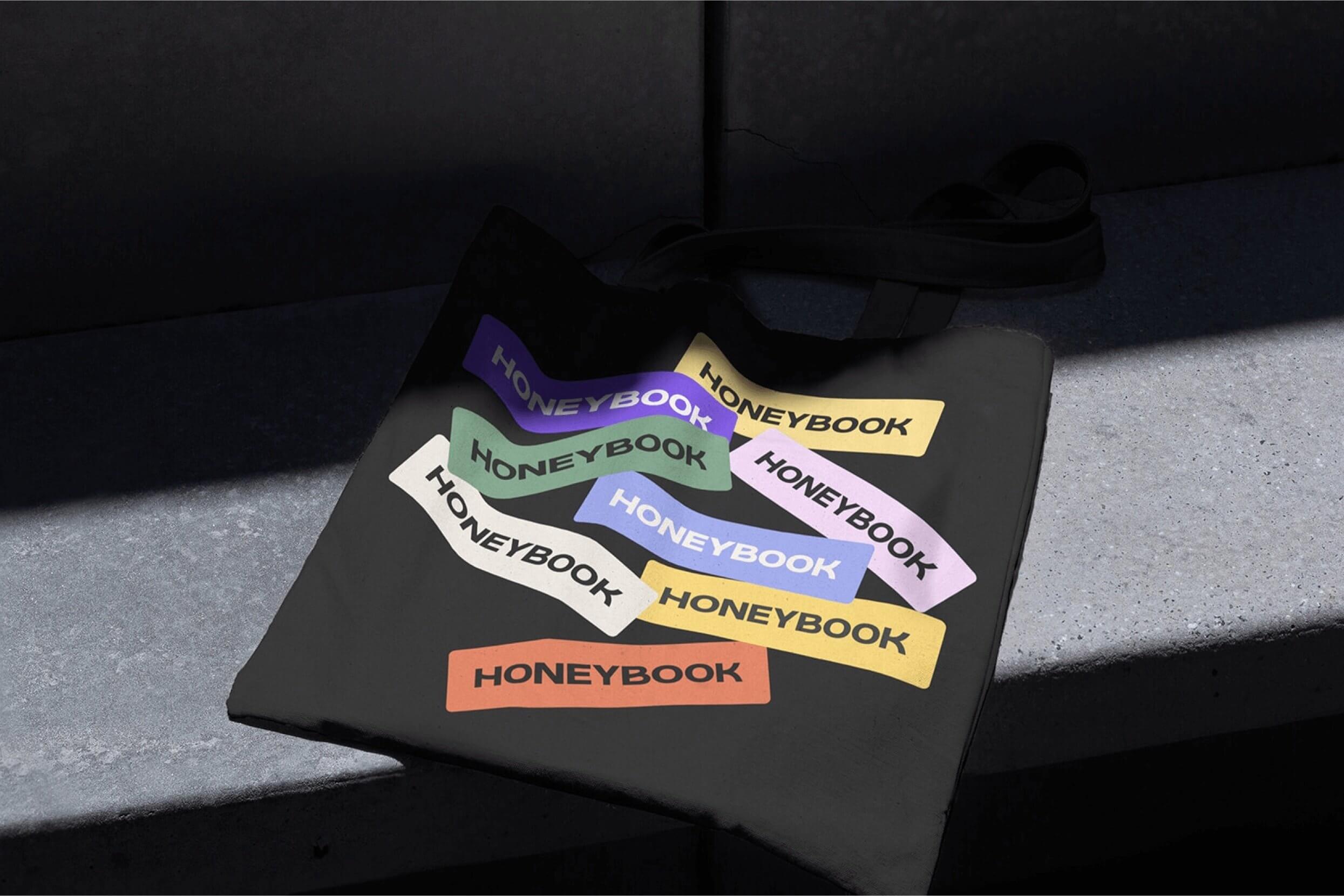
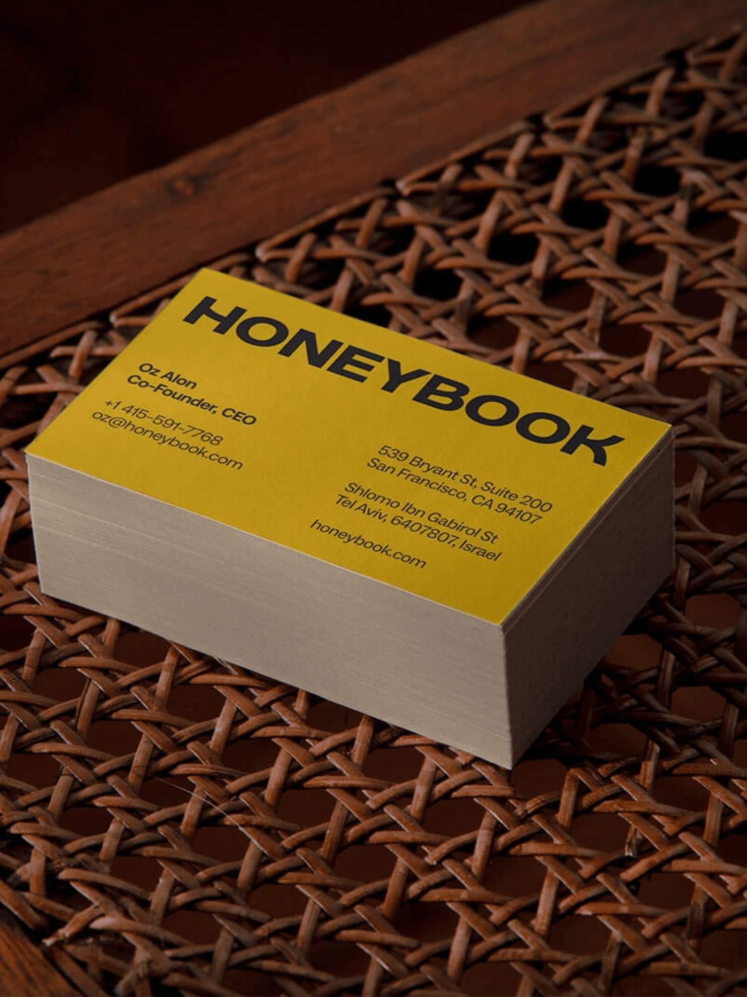
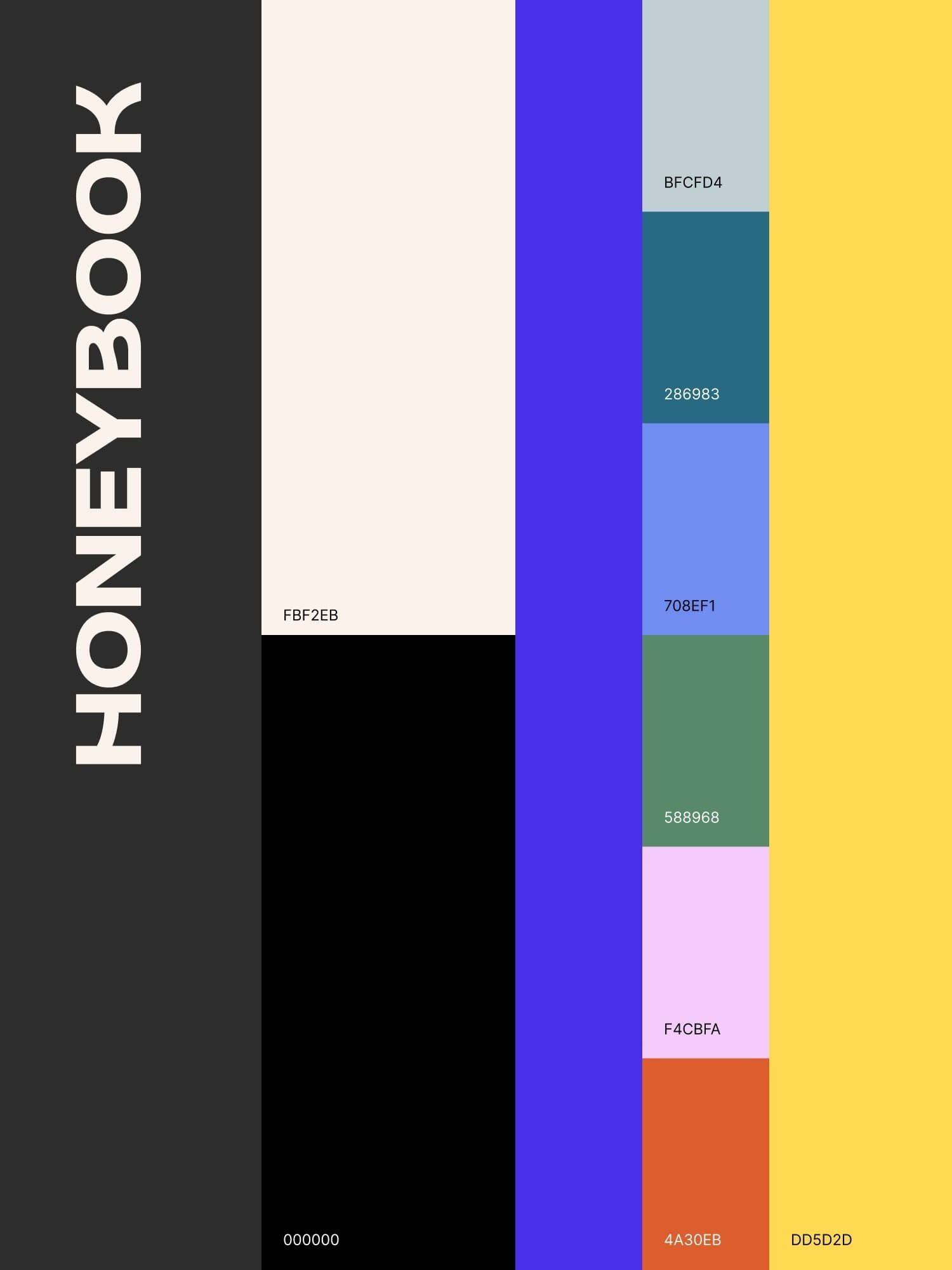
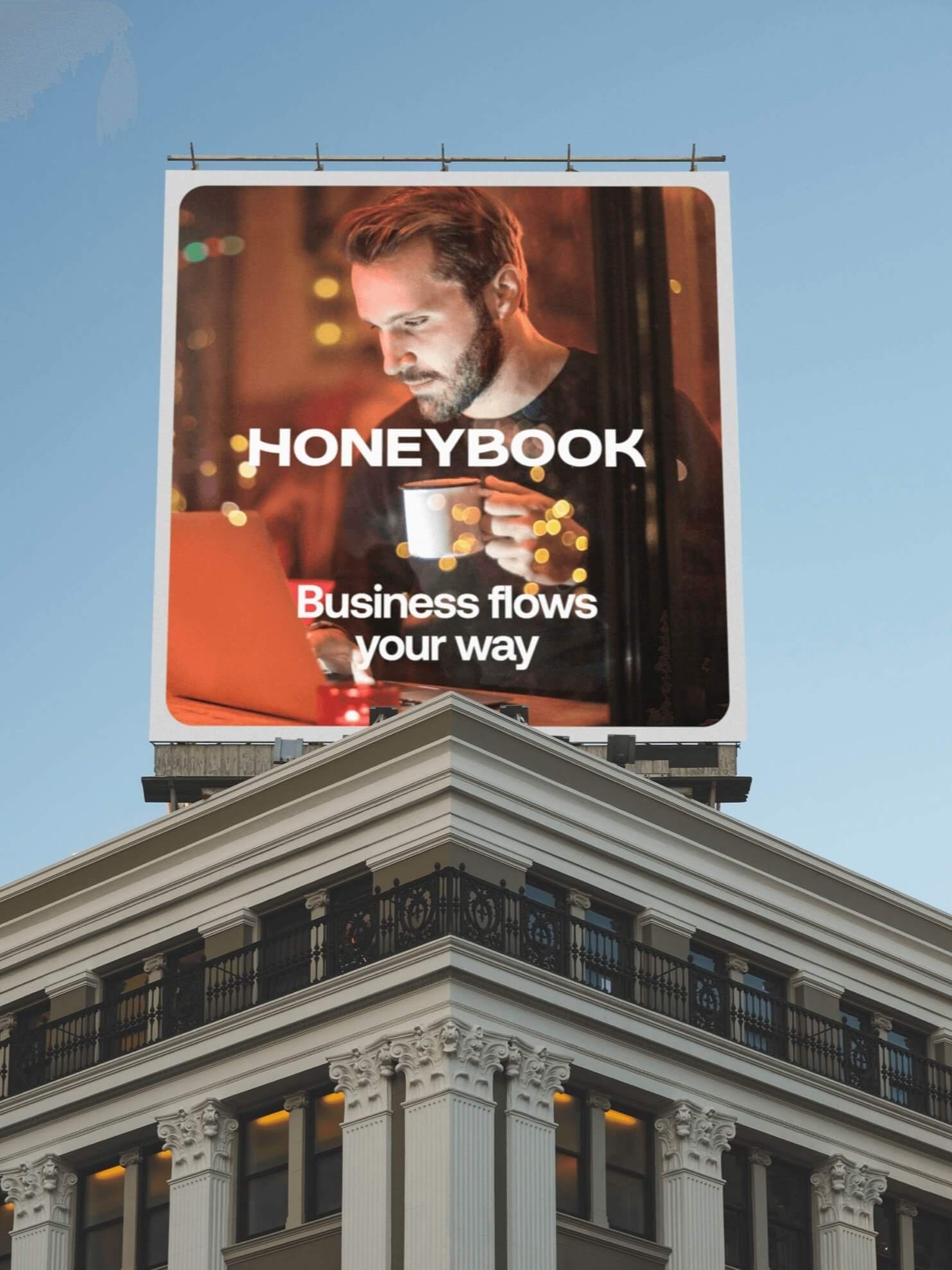
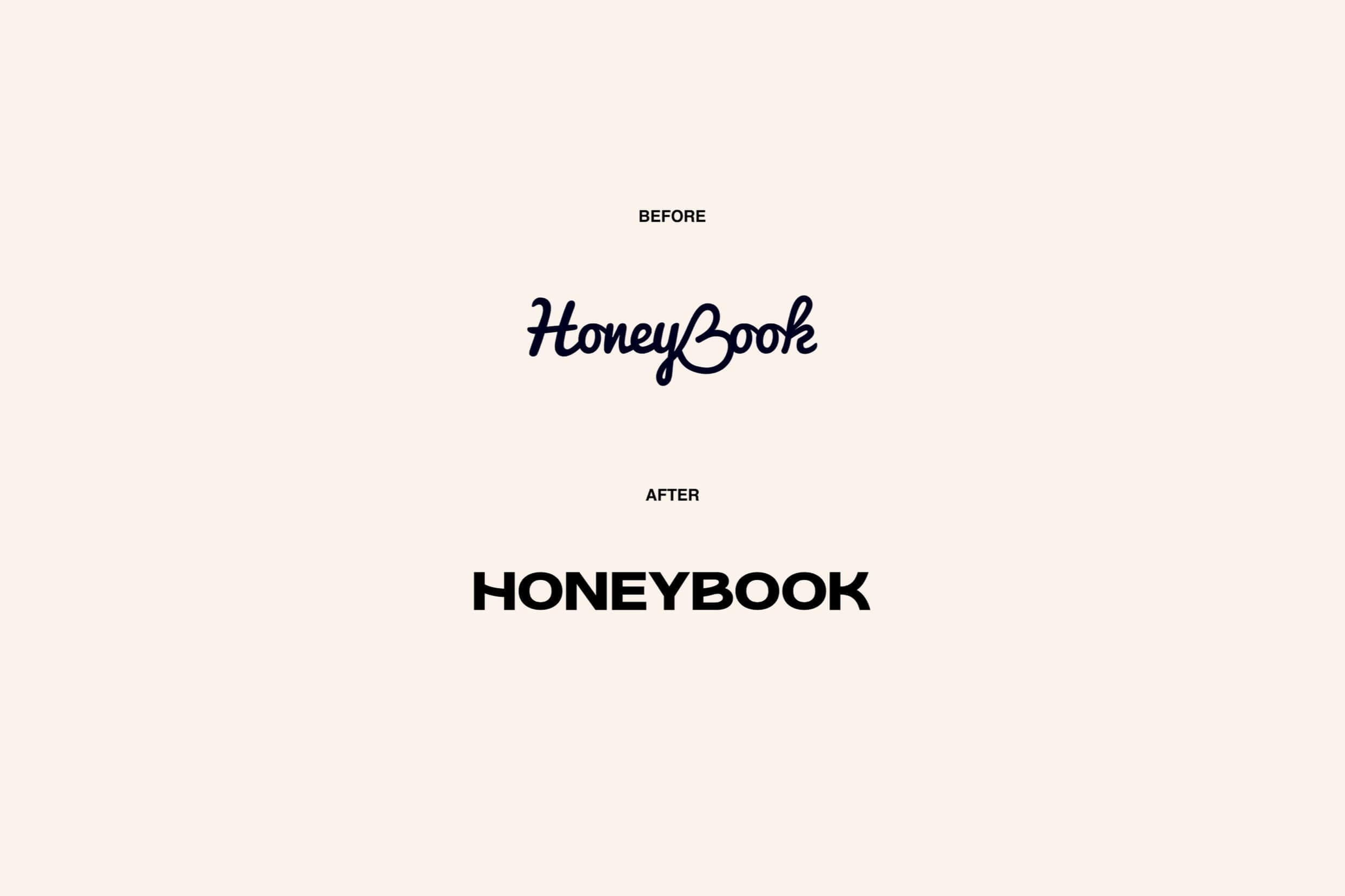
We created a new logo typeface for HoneyBook, the app for independent businesses who do it all, in support of the unicorn company’s first significant brand update.
Built around the concept of clientflow, the mark features customised characters which elicit the feeling of a smooth successful client project, from proposal to payment. Smooth motion treatment enhances the feeling of seamless flow.
The logo and logomark are weighty with high digital legibility and functionality - always an important consideration for an evolving digital product.






Collaborators
Type • Dave Foster
Motion • Matt Fowler & Jake Farmer
Brand Rollout • Company Policy
© 2025 Joel Wasserman . All rights reserved
I like to pay respect to the Traditional Custodians and First Peoples of NSW Australia, and acknowledge their continued connection to their country and culture.